Where the warmth of a luxury retreat meets the confidence of expert medical care.
The brief was clear from the first conversation: this shouldn't feel like "another aesthetic clinic." Not the neutral, wood-slat, stock-photo sameness popping up everywhere — and not cold or clinical either.
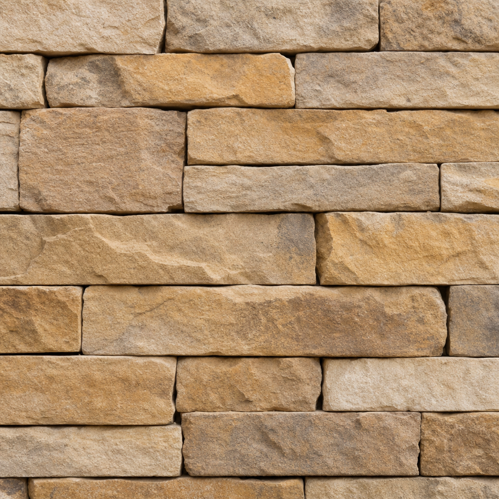
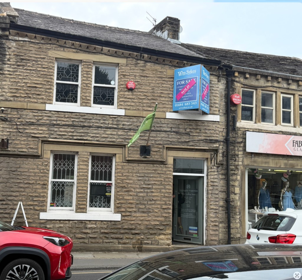
North House sits in a beautiful Yorkshire stone building, being taken back to brick and rebuilt properly — stone cladding from the lower ground up the staircase, arched openings between spaces. That gives us a rare thing: a brand and an interior designed together, from scratch, to say exactly the same thing.
This document sets the creative direction, shows where North House sits against the market, and lays out a clear scope and price so you always know what you're getting for your investment.
Everything below is drawn from your own words. The job of the brand is to make people feel this before they've read a single line of copy.
By appointment, considered, never mass-market. The quiet confidence of somewhere you feel lucky to have found — not the clinic advertising £99 lip offers.
Warm, homely, human. You're greeted like a guest in a beautiful home, not processed like a patient — given time for care that never feels rushed. This is the softness that sets us apart.
Genuinely medical. Expertise, discretion and results you can rely on — the credibility that earns a discerning, long-term client.
For discerning people who want to look like the best version of themselves, North House is the medical aesthetics clinic that pairs clinical expertise with a warm, considered welcome.
Calm and confident. We speak plainly and kindly — never salesy, never clinical jargon, never hype. Think a trusted expert who also happens to be lovely company. Editorial, not "influencer."
North House should feel continuous — not a clinic bolted onto an Instagram page, or aftercare left to chance. One experience, designed end to end.
Every touchpoint is intentionally designed.
Brand, digital, space and follow-up aren't separate jobs — they're one system. That's why this work goes beyond interiors alone. A path this considered maximises what the house gains from loyalty and recommendation — every touchpoint earning its keep, trust compounding, the business growing because the experience is complete.
I looked at the clinics you mentioned, the wider high-end UK aesthetics market, and the brands you're drawn to. There's a clear, open space that suits North House perfectly.
| Brand | What they do well | The gap / where it falls short |
|---|---|---|
| Coppergate Clinic | Boutique private hospital in York; strong surgical credibility, family-run warmth, established reputation. | Your read exactly: closest to the vision but the identity feels dated and heavy — it doesn't look as premium as the care behind it. |
| Dentistry @ Holme | Local, award-winning; nails the "luxury hotel, not clinical" feeling in-room, spa-like and calming. | The brand and website don't finish the story — pleasant but generic, lacking personality and familiarity; not the full, cohesive package end-to-end. |
| The London set Mesglo · Dr Harry |
Doctor-led editorial luxury at a high polish — the refined, aspirational standard most people admire. Credible, considered, unmistakably premium. | Cool, dark and metropolitan rather than warm and homely. Impressive, but not the Yorkshire welcome North House can own. |
| The "wood-slat" crowd | Clean, on-trend, inexpensive to produce. | Same neutral palette, same slat walls, same stock imagery. Interchangeable — the very thing you don't want to be. |
The market splits two ways: cold-but-clinical, or on-trend-but-generic. The genuinely luxurious brands tend to be cool and editorial. Almost no one is delivering real medical credibility and the warm, characterful welcome of a great hotel. That's the quadrant North House can own.
Editorial luxury done with restraint — generous white space, elegant serif/sans pairing, product treated like art. Our cue for polish and confidence.
Understated, grown-up, quietly expensive. Nothing shouts. Our cue for tone and taste — refined over loud.
Yorkshire luxury: heritage building, contemporary opulence, faultless hospitality. Our cue for warmth + place — exactly the feeling on arrival.
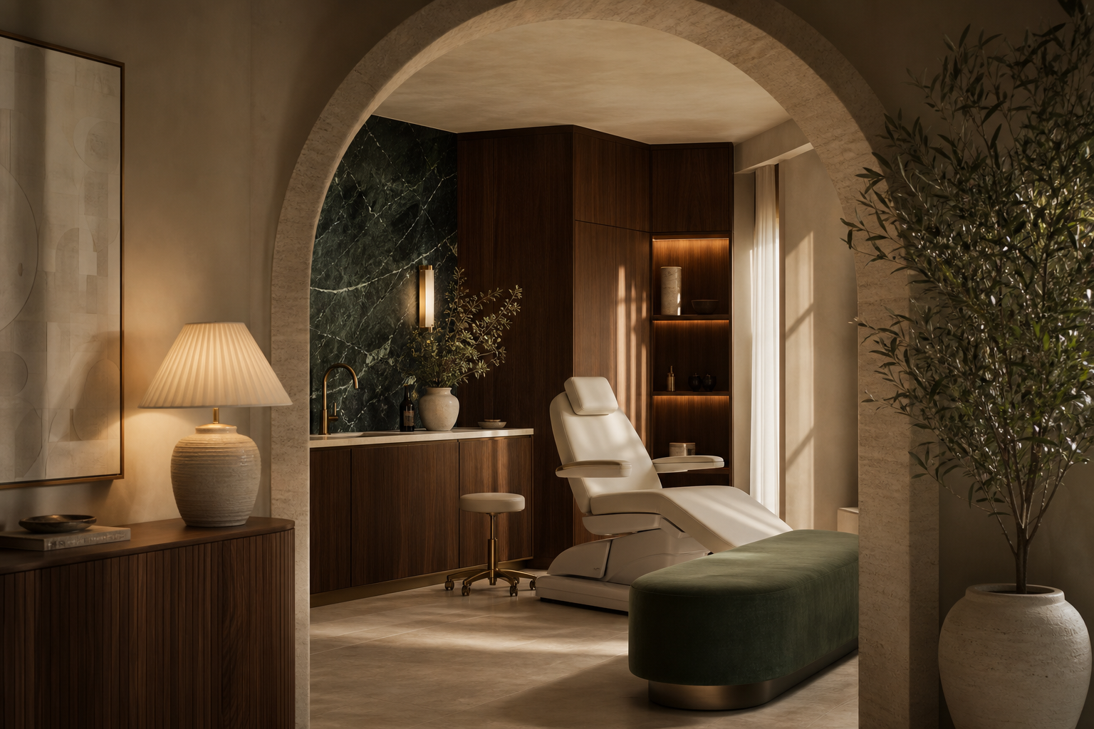
North House wins by being the warmest credible clinic in the room. Heritage stone building, arched thresholds, walnut and brass, a botanical-green signature — hotel-grade hospitality wrapped around real medical trust. It should feel less like "a clinic near me" and more like a private members' retreat you're quietly thrilled to belong to.
Built around the materials, arches and pieces you're already drawn to — so the brand and the building tell one continuous story.


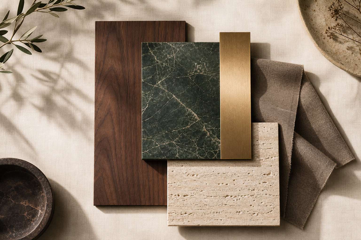
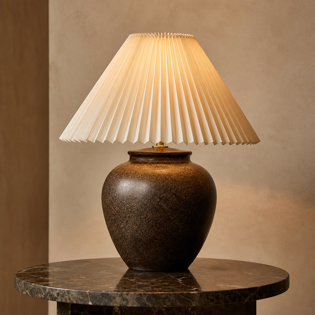
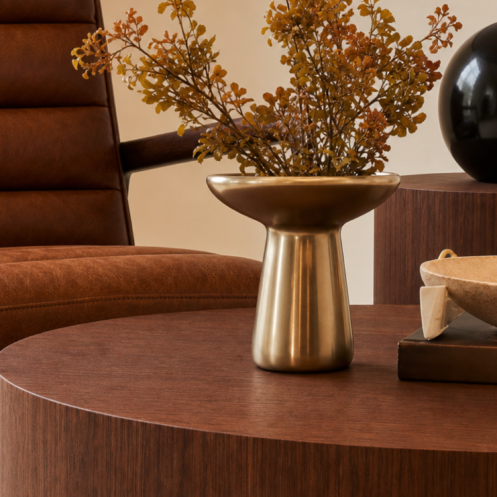
Walnut, natural stone, lacquered botanical green, brushed brass, warm plaster, textured linen.
The arch — open arched thresholds and arched treatment-room doors, echoed in the logo and across every touchpoint.
Warm, low and layered — lamps over downlights. Golden, flattering, hotel-like; never bright-white clinical.
Product displayed like a boutique, considered stationery, big-leaf live plants, tactile finishes.
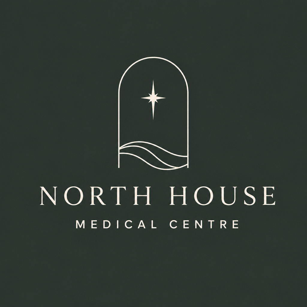
The primary identity is an arched frame holding a north star and soft hill contours — a mark that belongs to Yorkshire and to the building, not a generic clinic lockup.
Primary — botanical green · used throughout
Primary — ivory / light
These lockups are directional samples for now. A full logo exercise with options is part of Phase 1 Brand Strategy & Identity.
Simple contour lines — minimal, beautiful and instantly regional.
Holmfirth sits in a valley — the arch becomes the valley, and the doorway home.
Those elegant old Yorkshire bridges — a single refined arch, very grown-up.
Not a literal N — the idea of orientation, guidance and heading north. A quiet story.
Logo, headings, signage & key brand elements.
Primary backgrounds & website sections.
Secondary backgrounds & subtle design elements.
Icons, borders & supporting graphics.
Accent — call-to-action, foliage & premium highlights.
Optional metallic — foil, hardware & fine detail. Drawn from the interior.
Your original palette, kept intact — with a brushed-brass metallic added as an optional accent to echo the walnut-and-brass materials in the space.
A calm, confident voice for treatment descriptions, the website and your patient journey — highly legible, contemporary and quietly premium. Used at a light weight with generous spacing, it lets the serif headings and photography do the talking.
North House
North House
North House
Both are free, professional Google Fonts — no licensing cost, and they work across the website, print and social.
A first look at the identity applied across the pieces in your scope — website, social and signage.
Website — homepage through the considered treatments menu
Six rotating post templates — swap copy & imagery weekly
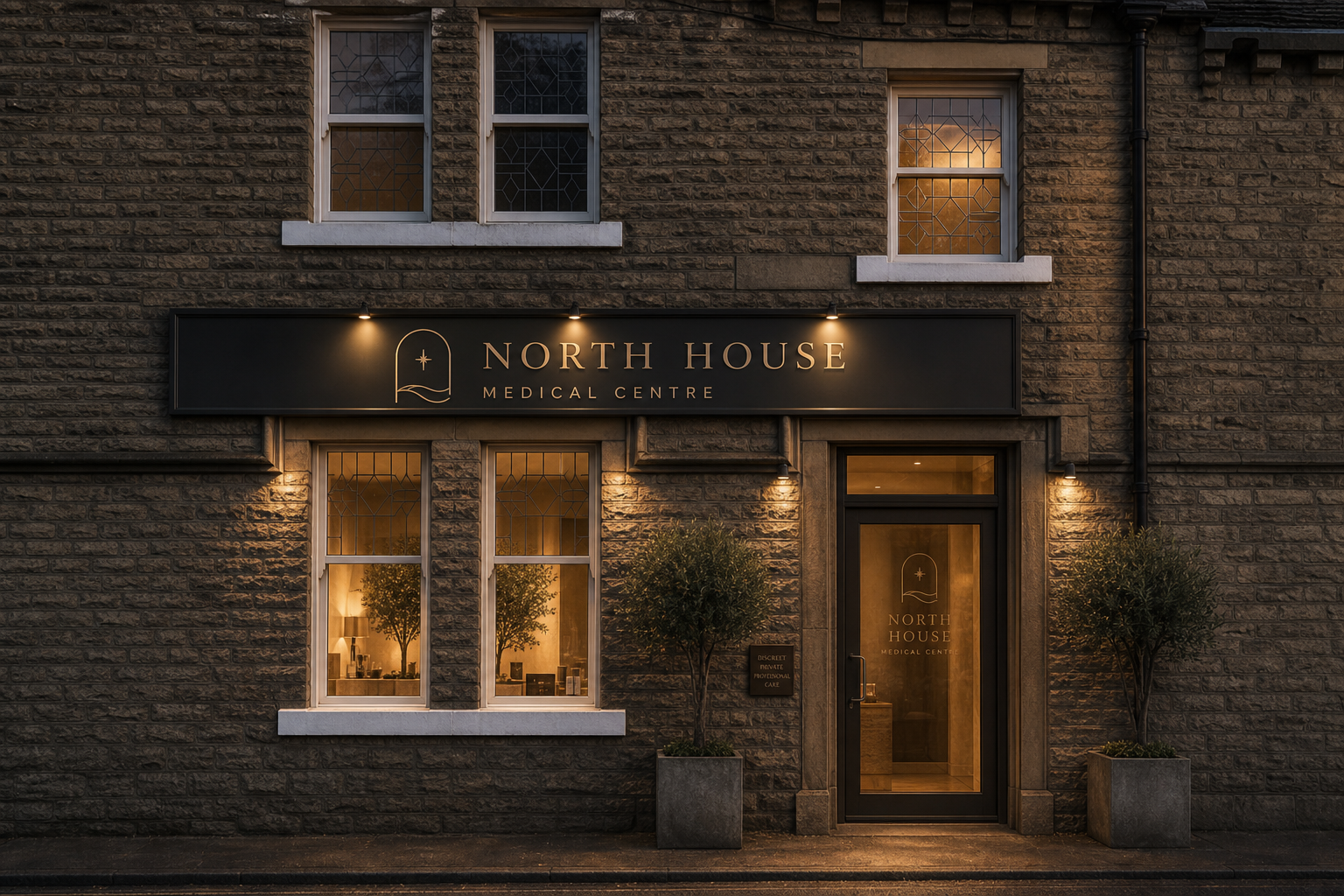
Day frontage on real Yorkshire stone — centred fascia wordmark (wording only), calm top trough wash, evening-style gooseneck lights, icon-only projecting sign with top strip light, ivy window boxes, opening times on the door, and the warm reception desk readable through the ground-floor windows. Evening and Today insets for reference.


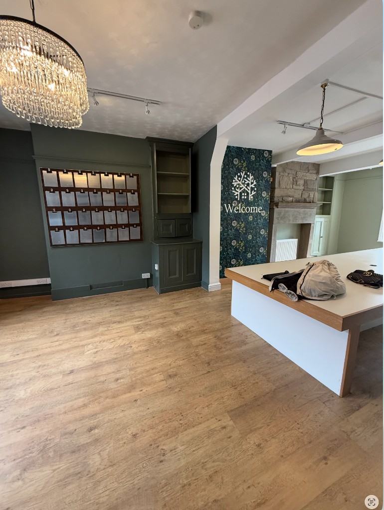
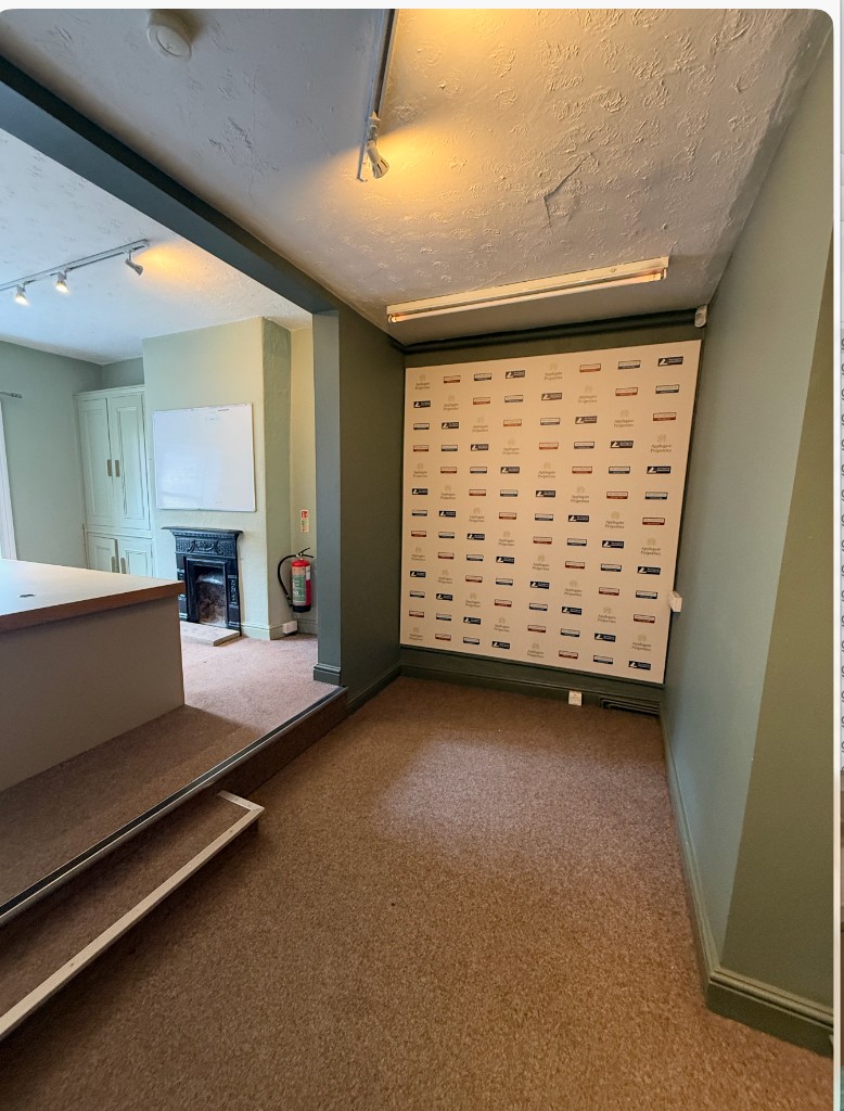
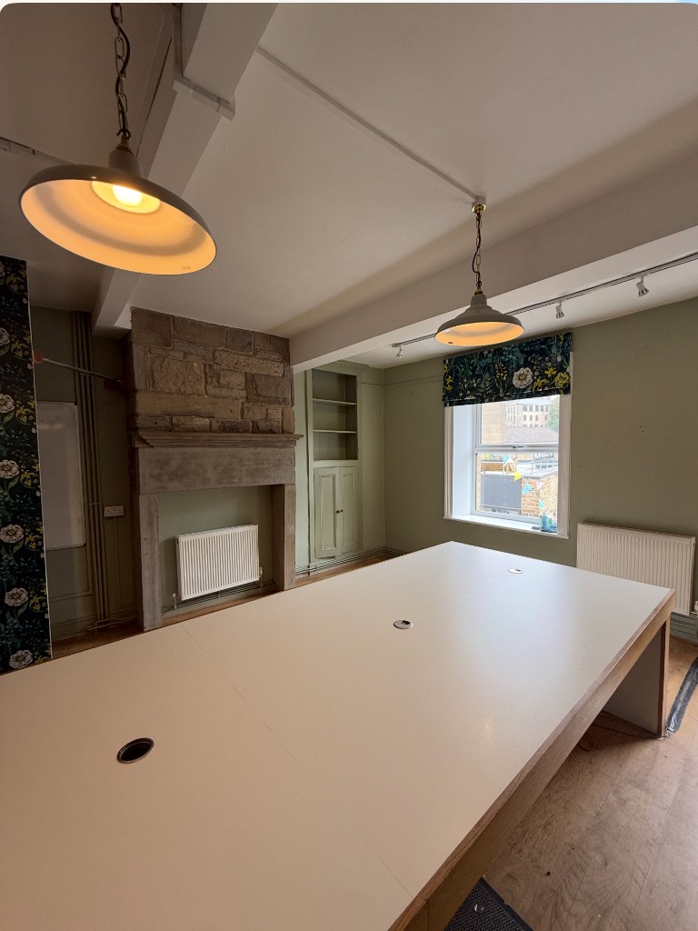
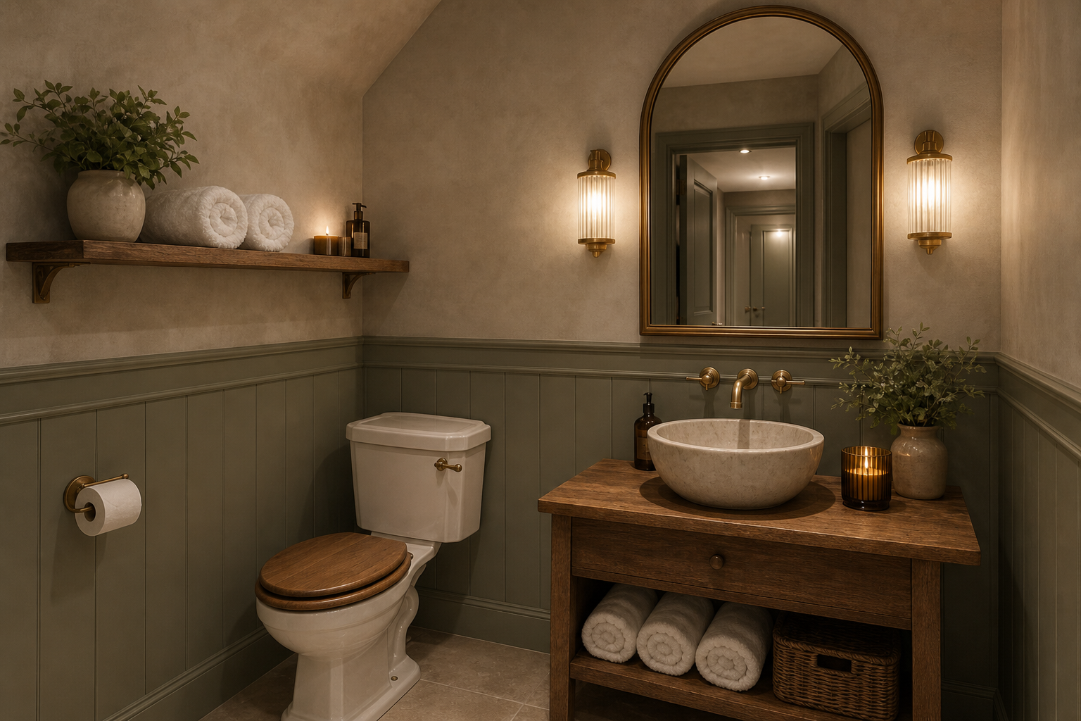
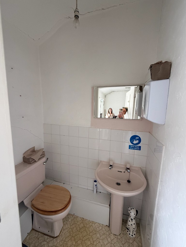
First-pass concept renders of key spaces — each with a Today inset so you can read current vs proposed. We'll refine these after this round once direction is locked.

Same left-to-right order — narrower product arch with Obagi/Medic8; dark walnut desk with North House Medical Centre; backlit arch icon on the wall behind the desk; stone arch then stairs. Zoomed out for a lounge with sofa, walnut coffee table, wicker rug and olive tree on dark wood floors.

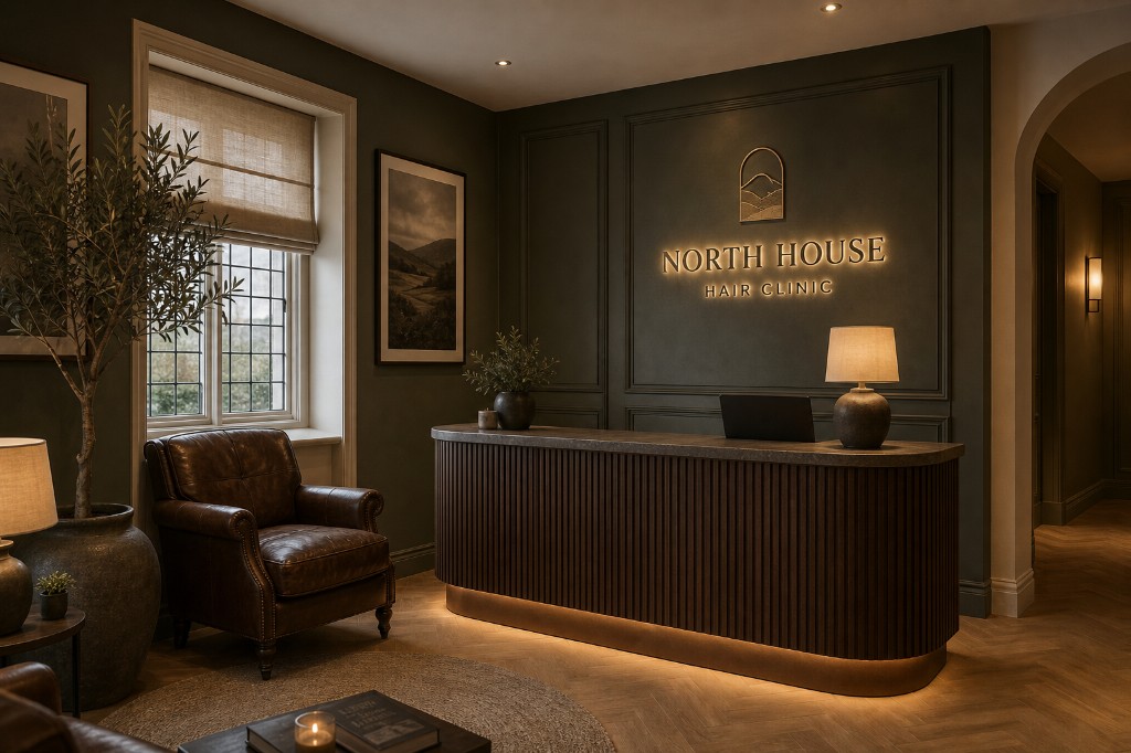
Zoomed back: stairs stay put on the left with a faux Yorkshire stone stair wall and paired lit artworks; stone arch directly beside them opens into the treatment room; reception sits on the back wall (site logo-wall position) — botanical-green panelling, walnut ribbed desk with under-glow, softly backlit arch+star icon.

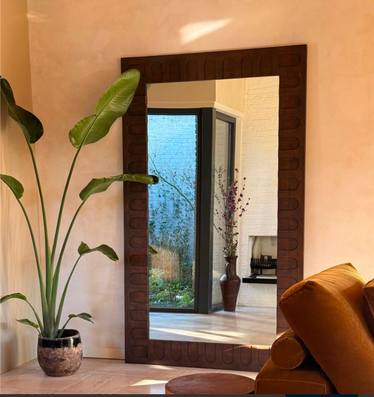
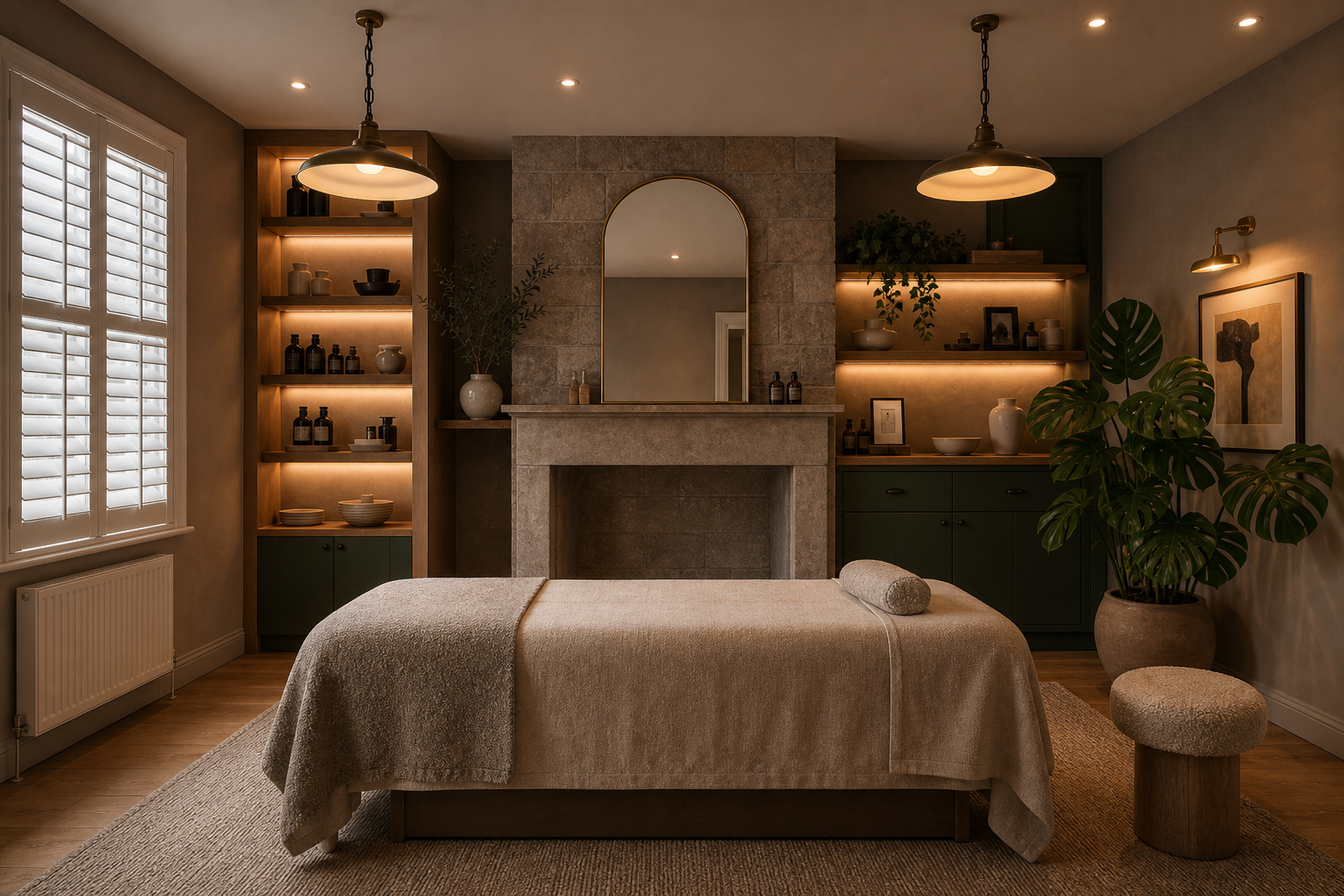
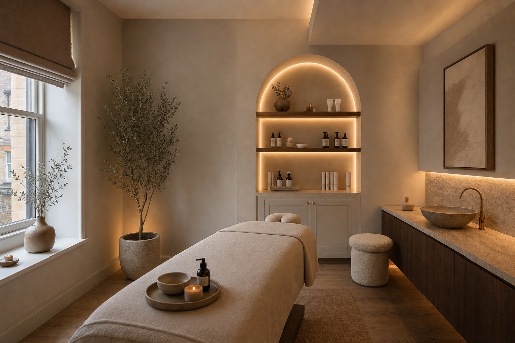
Warm spa-clinic calm — stone fireplace, arched mirror, backlit shelving, and substantial live plants with big green leaves. Plantation shutters in place of the fabric blind, with recessed spotlights in the ceiling for controlled light.

Still premium — microcement / large-format tile and warm brass, hotel-spa quiet rather than busy wallpaper.
The small, brandable experiences that make North House unmistakable — the details guests feel before they can name why they love it.
These are the details guests remember.
Directional ideas to explore in Experience & Launch — some fold naturally into the journey, others are optional elevations when the time is right.
Three phases from strategy & identity through launch. Figures cover the initial 12 months and include ongoing creative support valued at around £1,200.
Foundations and the mark — one package.
Deliverables: Strategy lock / sign-off pack, moodboards, logo suite, palette, type, devices, guidelines, interior & signage direction
Space and screen, designed together.
Deliverables: Interior Visual Package, full website design (all key pages)
Go live, then keep it sharp.
Deliverables: Gift voucher, treatment plan booklet, appointment cards & print stationery, email templates, Instagram kit (6 templates + highlights), website development & live site
Retainer value ~£1,200 included for the initial 12 months — gifted. Ongoing creative support so the brand stays considered after launch, not abandoned on opening day. Happy to handle website updates on your behalf if you'd rather not touch the CMS yourself.
The site is planned so it can work with Fresha for appointments, and so product retail (Medic8, Obagi and beyond) can sit naturally in the experience — not bolted on later. We design the journey and the pages around those needs from the start; exact setup depends on how you want bookings and shop to run at launch.
Cash and treatment-swap. Domain is already yours; hosting & domain renewal billed at cost. Beyond Phase 3, I only charge for time spent.
Each phase builds on the last. We can pause between stages if the fit-out timeline needs it — sensible order stays Strategy & Identity → Experience → Launch.
Lock strategy, journey and positioning; then logo suite, palette, type, devices, guidelines, and interior & signage direction — ready for the fit-out.
Interior visualisations refined; website designed end-to-end (including product / shop pathway), developer-ready before build.
Gift voucher, treatment plan booklet, appointment cards & print stationery, email templates, Instagram kit, website development & go-live (build oversight, SEO, analytics, Fresha), with ongoing creative support for the initial 12 months.
Happy to walk through any of it, adjust phasing, or start with Strategy & Identity. — April