NH
Version 02 · Evolved direction
Brand & Spatial Direction

North House

Holmfirth

A Yorkshire townhouse, quietly reimagined as a luxury wellness house — where medical expertise feels like the warmest welcome in the valley.

Prepared forRachel — Founder
Prepared byApril
This versionDirection · Identity · The Building
i — The shift
Where version 2 goes

Not another clinic. A house.

The more I sat with the building, the clearer it became: North House shouldn't look like another aesthetic clinic at all. It should feel like a Yorkshire townhouse turned luxury wellness house — Soho House, Aesop and The Pig, not Harley Street white boxes.

Luxury has moved on. It's no longer marble everywhere, gold mirrors and LED strips. Real luxury now feels quiet — warm limewash, honest stone, walnut, boucle, low golden light and lots of texture. That happens to be exactly what this heritage building wants to be.

So this version leans all the way into that. One continuous idea — the arch of the valley — running from the identity through every room. The building becomes the brand.
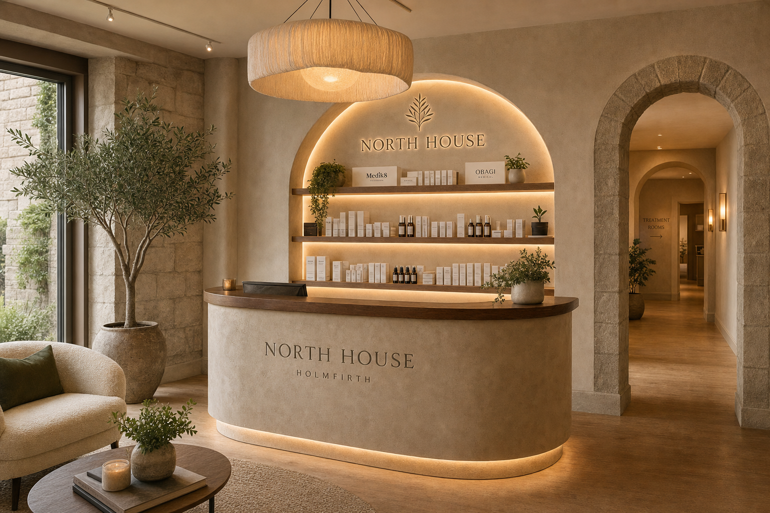
North House reception concept — limewash concierge desk and illuminated arched retail niche
Concept render — reception & retail, North House Holmfirth
01 — Approach
The thinking behind it

This is strategy, not just pretty pictures.

Before a single logo, the real work was understanding the place and the journey through it. That groundwork is what makes everything that follows feel inevitable — and it's the part that quietly de-risks the whole project.

01

Visited & read the property

Walked the space, read the light, the bones and the flow — not guessing from a floor plan.

02

Measured the atmosphere

Defined how it should feel the moment someone steps in from the street.

03

Solved the customer flow

Front door → concierge reception → arch → treatment rooms, with retail leading the room.

04

Started the architecture

Stud wall and archway to the treatment rooms, the retail niche, the fireplaces kept as heroes.

05

Found brand opportunities

A signature scent, luxury retail, photograph-me moments — revenue and reputation, not decoration.

06

Re-rooted the identity

Moved the mark away from generic "luxury" and into Holmfirth itself — and visualised it all in situ.

A note on value

What you're looking at already blends strategy, interior direction and brand thinking — genuinely the first slice of the project. The room visualisations below are an example of a distinct spatial visualisation workstream (priced separately), included here so you can see and feel the direction before committing. Everything is phaseable; nothing locks you in.

02 — Strategy
Brand strategy

Quiet luxury, with real medical trust.

Three feelings do all the work. Everything — the identity, the interiors, the words — exists to make people feel these before they've read a single line of copy.

01

Exclusive

By appointment, considered, never mass-market. The quiet confidence of somewhere you feel lucky to have found — not the clinic advertising £99 lip offers.

02

Welcoming

Warm, homely, human. You're received like a guest in a beautiful home, not processed like a patient. This is the softness that sets us apart.

03

Trustworthy

Genuinely medical. Expertise, discretion and results you can rely on — the credibility that earns a discerning, long-term client.

The reference set — our north star
Soho HouseAesopAman Spa Deplar FarmThe Pig Hotels
What we're moving away from

Harley Street white boxes · marble everywhere · gold mirrors · LED strips on every edge. Impressive, maybe — but cold, and everywhere. North House should feel like the opposite of that.

Positioning statement

For discerning people who want to feel like the best version of themselves, North House is the Yorkshire wellness house that pairs real medical expertise with the warmth, taste and calm of a great country hotel.

03 — Market
Competitor & market analysis

Where North House sits — and the gap it owns.

The market splits two ways: cold-but-clinical, or on-trend-but-generic. The genuinely luxurious names tend to be cool and editorial. Almost nobody delivers real medical credibility and the warm, characterful welcome of a great hotel. That quadrant is wide open.

Positioning map

Warm + credible is empty.

Push North House into the top-left: distinctive and luxurious, and unmistakably warm. The heritage building, the arches and a quiet-luxury material palette get us there in a way a logo alone never could.

Distinctive · Luxury Generic · Commodity Warm · Welcoming Cool · Clinical
North House
London set
Coppergate
Dentistry @ Holme
Wood-slat crowd
Soho House

Members'-club warmth — worn leather, texture, low light, nothing shouting. Our cue for belonging and ease.

Aesop

Restraint as luxury — raw materials, product treated like apothecary art, retail as theatre. Our cue for the retail niche.

The Pig / Deplar Farm

Countryside luxury rooted in its place, faultless hospitality. Our cue for warmth + Yorkshire.

The takeaway

North House wins by being the warmest credible clinic in the room — a heritage stone house full of arches, limewash, walnut and green, with hotel-grade hospitality wrapped around real medical trust. Less "a clinic near me," more "a private wellness house I'm quietly thrilled to belong to."

04 — Materials
Creative direction

Built from texture, not gloss.

Everything is drawn from the building and the Yorkshire it sits in. Lots of texture, very little shine — the palette does the luxury so nothing has to try too hard.

Warm Limewash
Yorkshire Stone
Walnut
Smoked Oak
Brushed Brass
Travertine
Bouclé
Linen
Olive Green
Forest Green
Dark Walnut
Antique Mirror
Signature form

Make the whole brand language arches.

Rather than trapping the arch inside a logo, let it become the geometry of the entire place — shelving, mirrors, doorways, the website, photography crops, signage. When the arch is everywhere, the building itself becomes part of the identity, and everything is instantly, unmistakably North House.

Light & feel

Warm, low and layered — lamps and concealed light over downlights. Golden and flattering, never bright-white clinical. Bold, characterful moments (the cloakroom, the retail niche) balanced by calm, restful treatment rooms.

Your direction, captured

The mood we're building to.

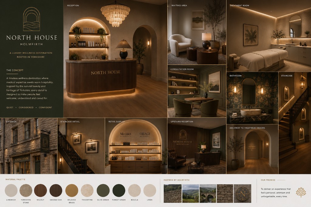
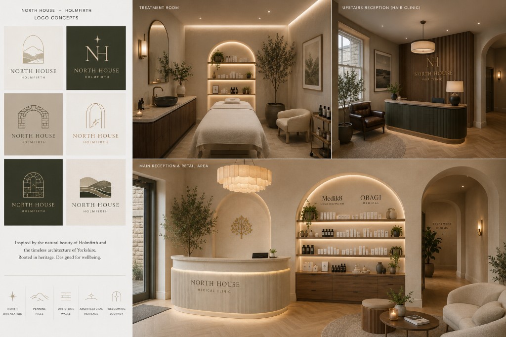
These are the boards we aligned on. The dark board below is the right feeling — heritage, arched, quietly expensive — I'm simply lifting it a touch lighter and warmer in the actual rooms so the space feels welcoming by day, which the renders further down show.

North House Holmfirth — logo concepts and warm render board
Identity concepts & warm renders — the target tone.
North House Holmfirth — full interior moodboard (darker)
Full moodboard — right direction, intentionally lifted lighter in situ.
05 — Identity
Logo & identity

A mark that belongs to Holmfirth.

This is the biggest opportunity in the whole project. The identity shouldn't feel like a generic "luxury logo" — it should feel like it could only be from here. So the concepts all start with the North, and with the arch of the valley.

Moving on from the first mark

The earlier lockup was elegant but a little "off-the-shelf luxury" — it didn't yet belong to the building. The directions below root it in real Yorkshire references so it feels earned, regional and impossible to copy.

Dry stone walls

The rhythm of Yorkshire dry stone, abstracted into a quiet geometric pattern or mark.

Pennine hills

Simple contour lines — minimal, beautiful and instantly regional.

The valley

Holmfirth sits in a valley — the arch becomes the valley, and the doorway home.

Packhorse bridge

Those elegant old Yorkshire bridges — a single refined arch, very grown-up.

Stone masonry

The coursing of local stone as a structured, architectural monogram.

Compass north

Not a literal N — the idea of orientation, guidance and heading north. A quiet story.

The big idea

Keep the logo itself incredibly simple — then let the arch become the brand's whole language: shelving, mirrors, doorways, website, type crops and photography frames all share the same geometry. The place and the brand become one thing.

Colour palette

Warm, grounded, quietly expensive.

Warm Limewash
#F7F4EF

Primary walls, backgrounds & website base.

Yorkshire Stone
#C7B79E

Secondary backgrounds & supporting graphics.

Walnut / Espresso
#4A4036

Logo, headings, signage & key elements.

Olive Green
#6E7257

Botanical accent & supporting tone.

Forest Green
#2F3A34

Depth — cloakroom, men's clinic, CTAs.

Brushed Brass · metallic
#A9885E

Foil, hardware & fine detail.

Lifted straight from the material palette, so the printed brand and the physical building always agree.

Typography

A classic serif, a clean modern sans.

Display / Headings — Cormorant Garamond
Made in the valley.
Aa Bb Cc Dd   1234567890   & ?!
Body / Interface — Jost

A calm, confident voice for treatments, the website and the patient journey — highly legible, contemporary and quietly premium. Used light, with generous spacing, it lets the serif headings, the arches and the photography do the talking.

Light 300 · Regular 400 · Medium 500

Both are free, professional Google Fonts — no licensing cost, and they work across web, print and social.

06 — The Building
Spatial visualisation · room by room

Seeing it, before a wall is touched.

Concept renders built from your own site photographs and notes — the same rooms, reimagined in the North House direction. Small inset = the space today. Large image = where it could go.

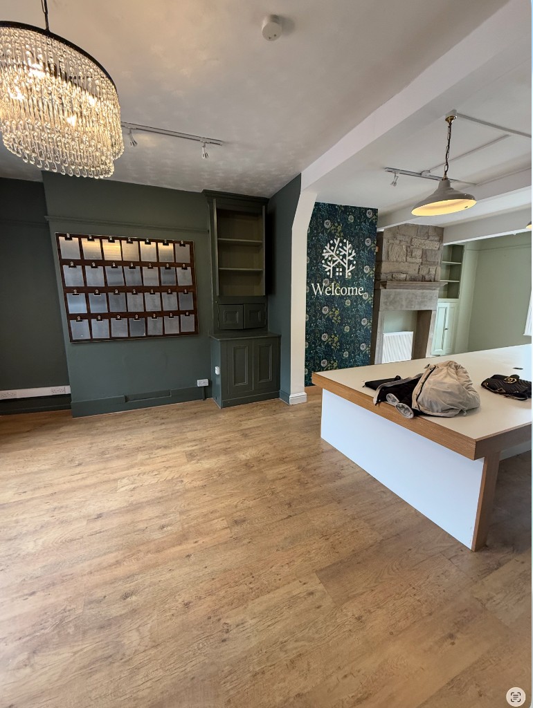
Reception and retail concept render
TodayReception today
Ground floor · arrival

Reception & retail

Concierge, not clinic. A low limewash-and-travertine desk that doesn't dominate, a statement sculptural pendant, and — the hero — an enormous illuminated arched niche merchandising Medik8 and Obagi like a jewellery store. A new stud wall with an open stone arch (no door) leads through to the treatment rooms. Retail leads the room, and lifts the perceived value of everything.

  • Arched retail niche
  • Statement light
  • Open arch to treatments
  • Concierge desk
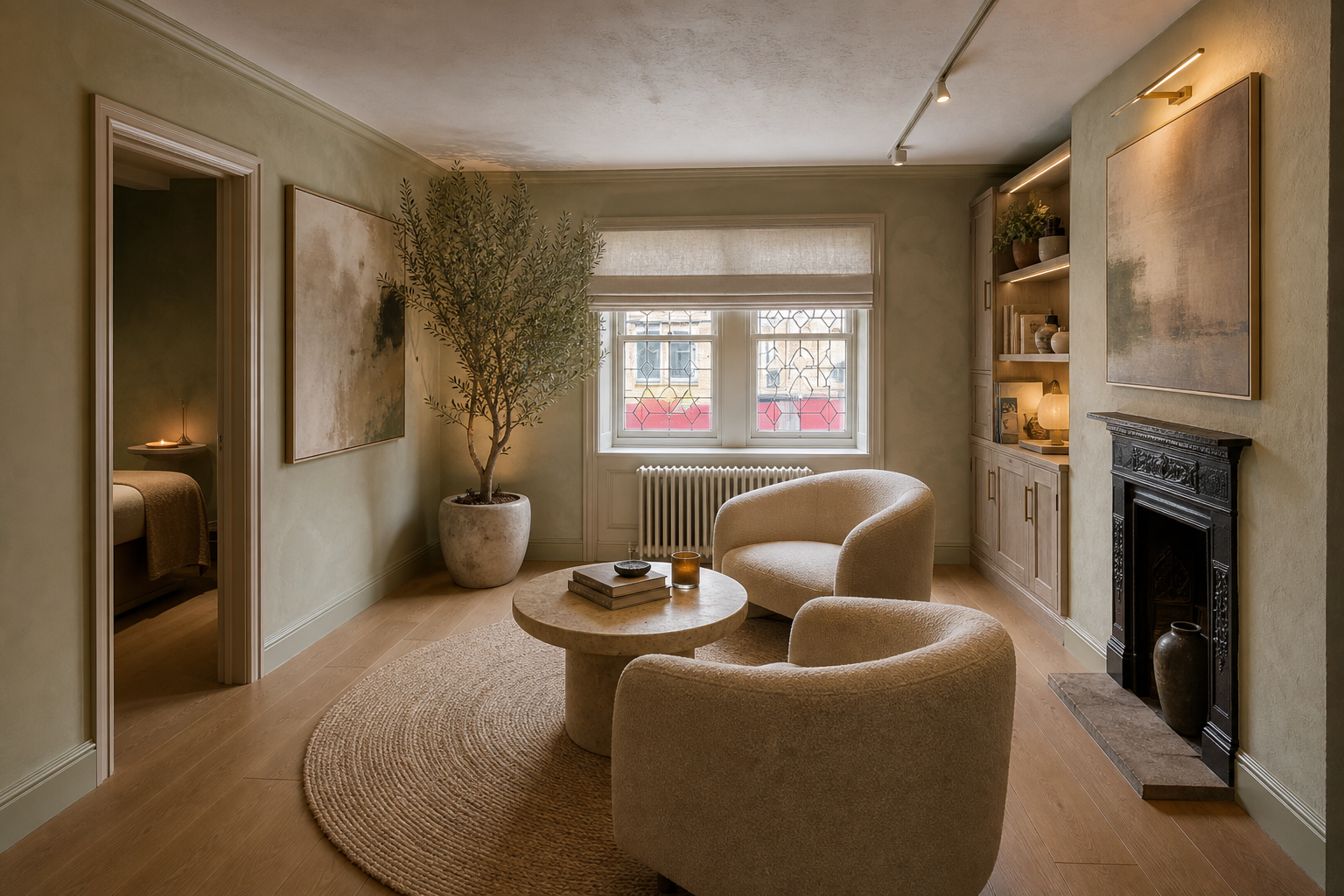
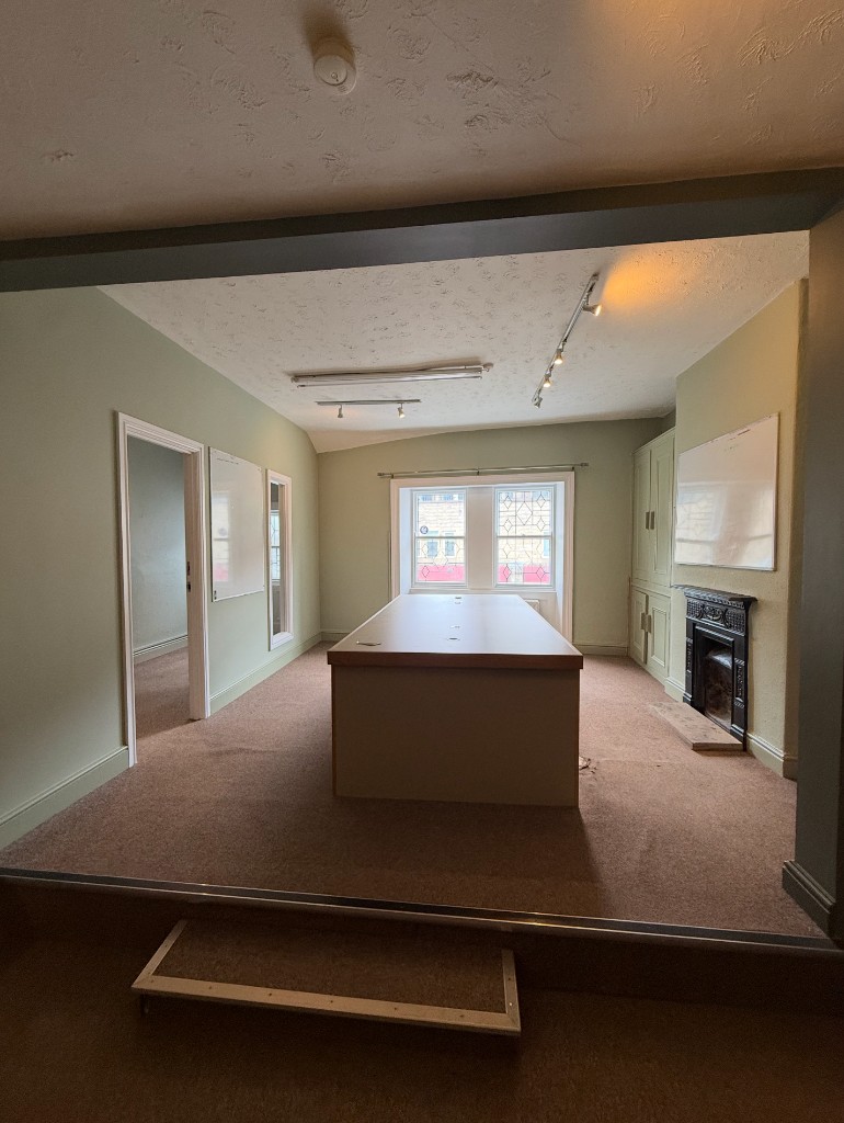
Consultation room concept render
TodayConsultation room today
First floor · consultation

The consultation room

Every trace of "office" removed. Bouclé consultation chairs on a circular rug, an oversized olive tree, fluted oak cabinetry and integrated shelving, indirect lighting and a large abstract artwork. The original fireplace becomes the focal point — never a TV.

  • Bouclé chairs
  • Circular rug
  • Olive tree
  • Fireplace focal
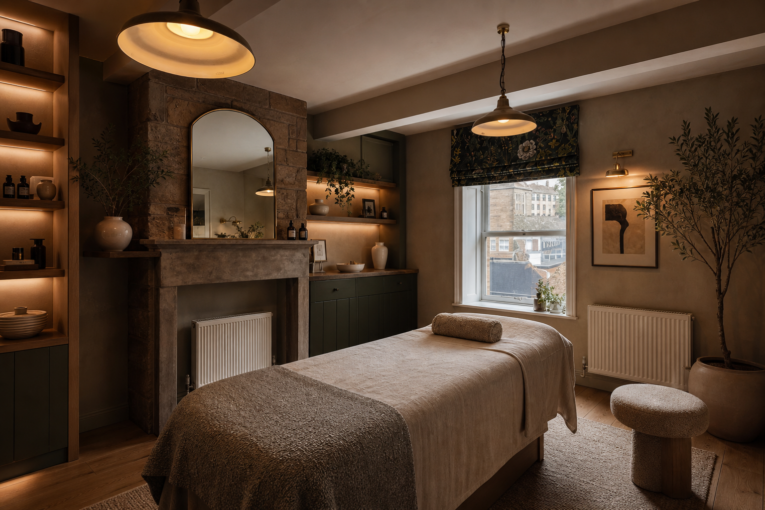
Treatment room with stone fireplace concept render
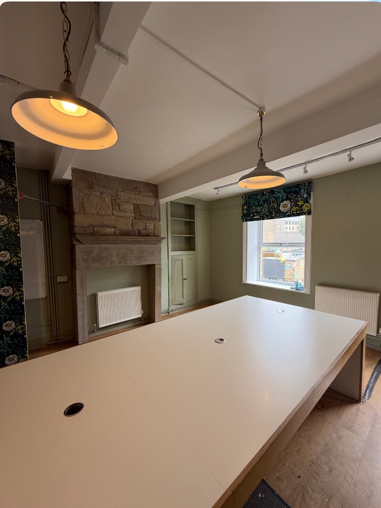
TodayStone fireplace room today
Ground floor · treatment

The stone fireplace room

Don't touch the fireplace — make it the heart. An arched antique mirror above, oak floating shelving either side, warm microcement walls and a bed dressed in linen and bouclé. Boutique hotel, not clinic. Absolutely no clinical white.

  • Keep the stone fireplace
  • Arched mirror
  • Microcement
  • Very warm light
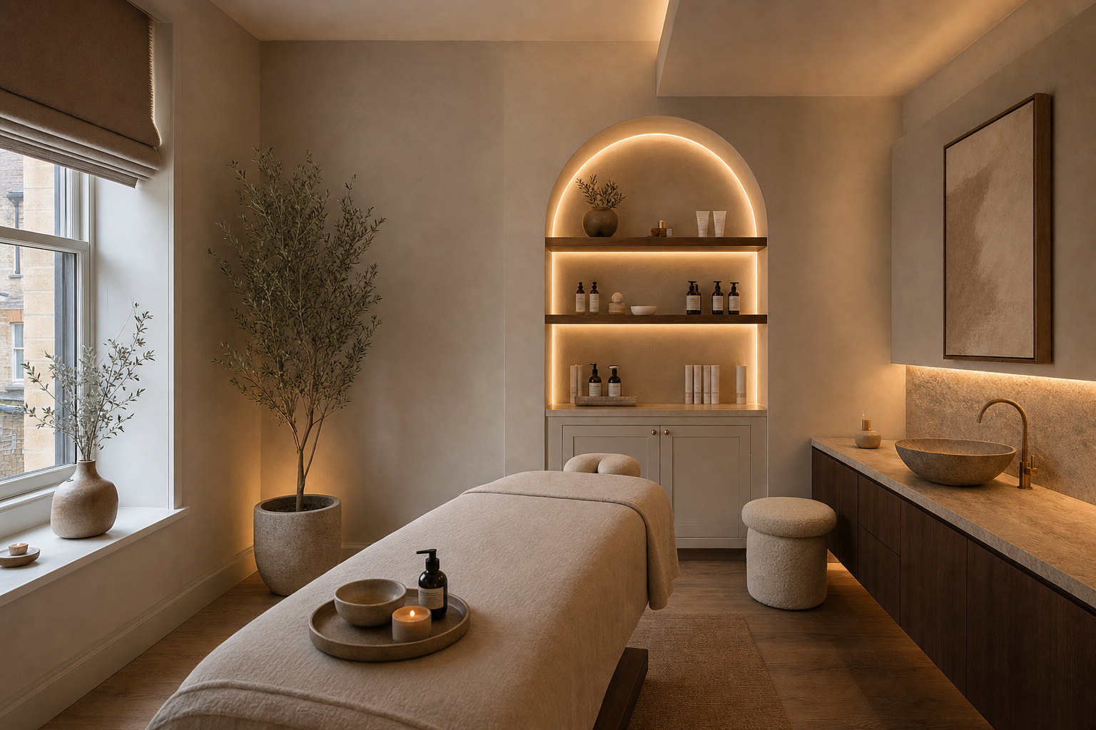
Second treatment room concept render
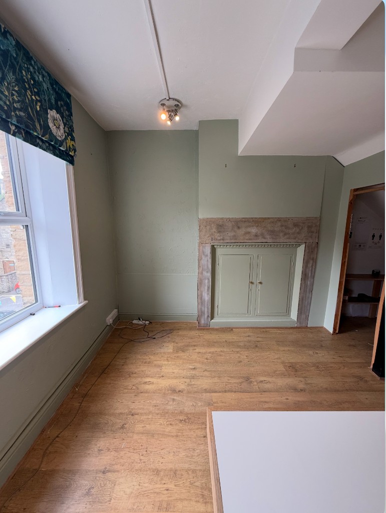
TodaySecond treatment room today
Ground floor · treatment

Treatment room, quiet & warm

The old store cupboard becomes an illuminated arched niche. Microcement walls, floating walnut cabinetry, concealed storage, calming artwork and a stone vessel basin — a restful counterpoint to the bolder rooms.

  • Arched niche
  • Floating cabinetry
  • Concealed storage
  • Calming art
Luxury cloakroom concept render
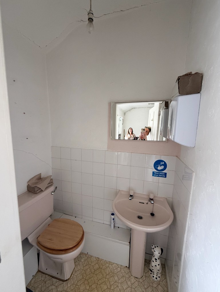
TodayBathroom today
Ground floor · cloakroom

The cloakroom

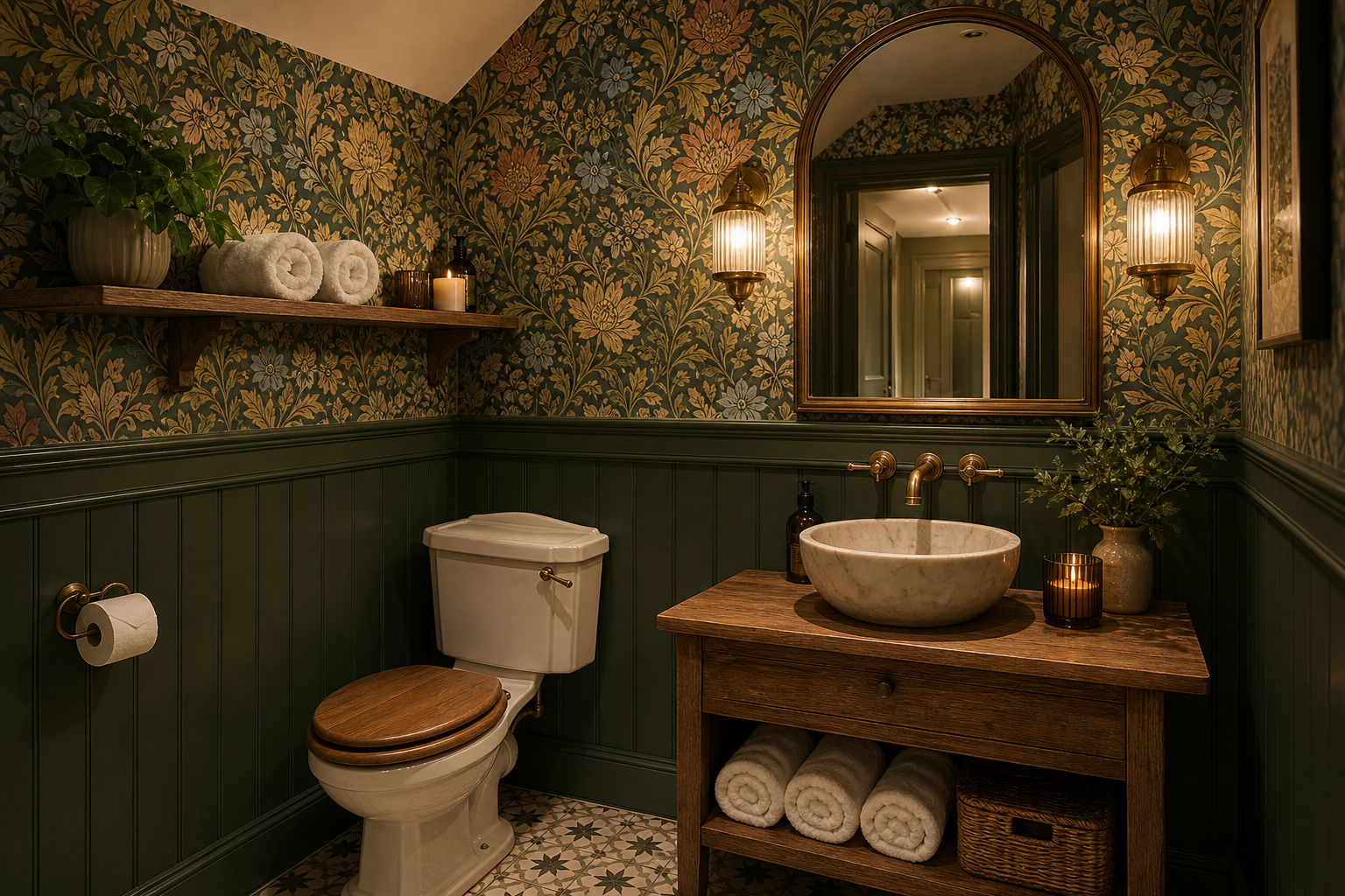
Possibly my favourite room. Forget clinic — think Soho Farmhouse. Deep green panelling, a bold botanical William Morris wallpaper that pops with colour, a stone basin, aged brass, an arched mirror, sconces, candles and oak shelves. People should walk out saying "even the loo is incredible."

  • Deep green
  • William Morris
  • Stone basin
  • Aged brass
Staircase concept render
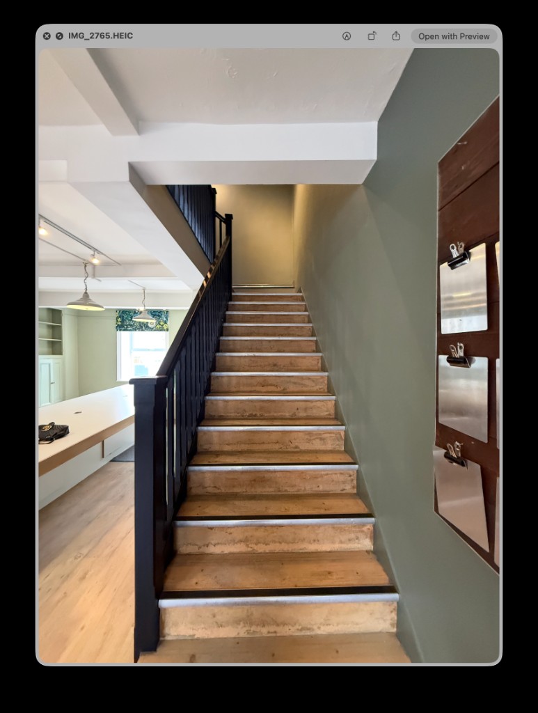
TodayStaircase today
Circulation · signature moment

The staircase

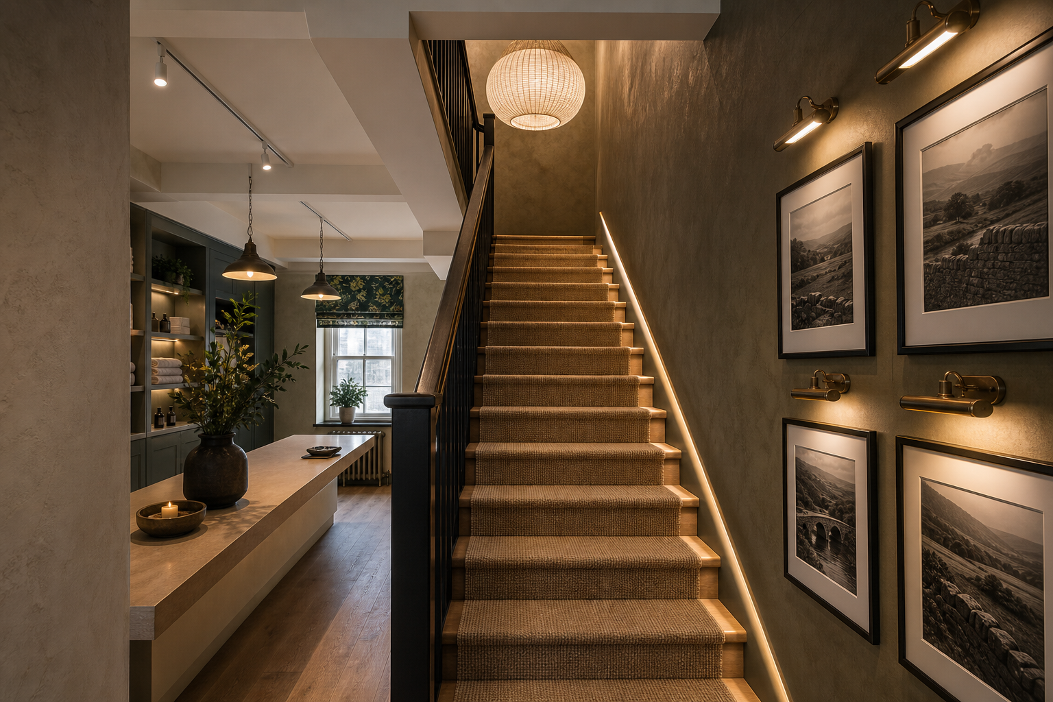
Treat the climb like walking into a boutique hotel. Textured limewash, aged-brass picture lights over framed Yorkshire photography, a soft glow under the handrail — and one sculptural pendant dropping through the void. The moment people remember and photograph.

  • Sculptural pendant
  • Brass picture lights
  • Yorkshire photography
  • Handrail lighting
Men's hair clinic reception concept render
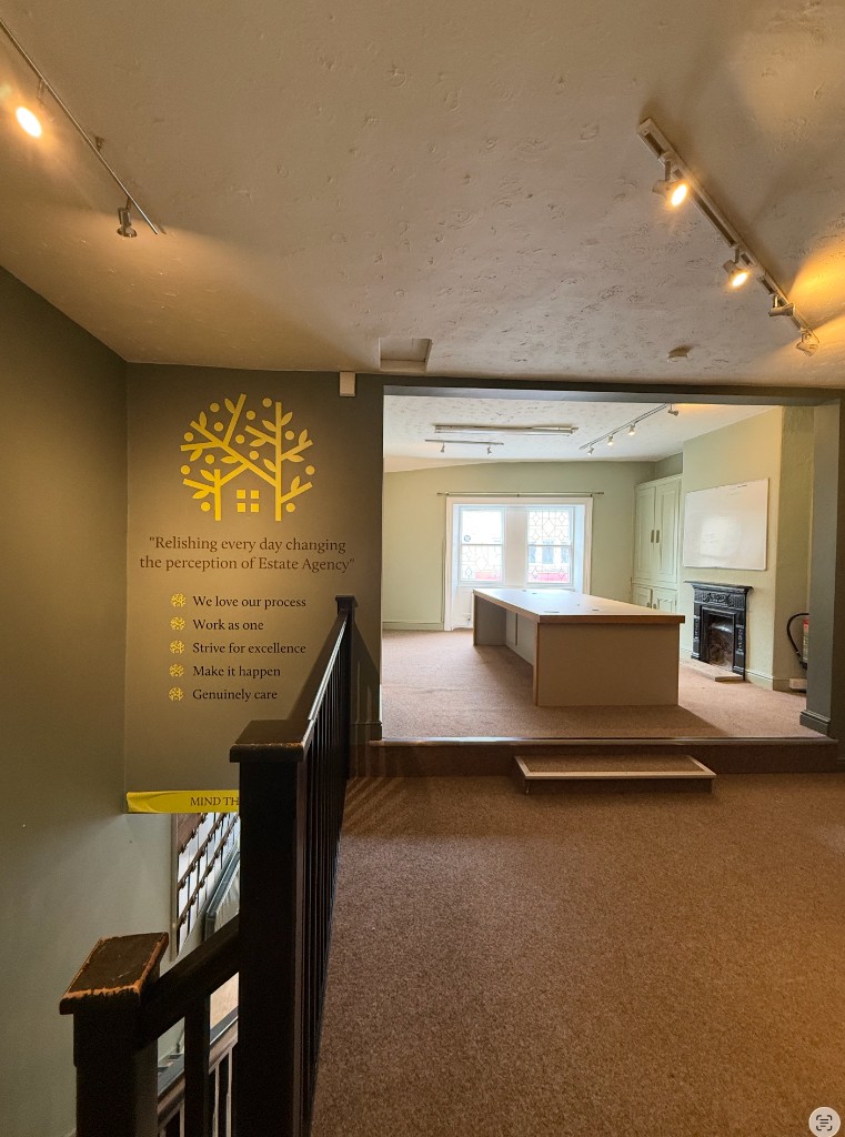
TodayUpstairs reception today
Second floor · men's hair clinic

A private members' club

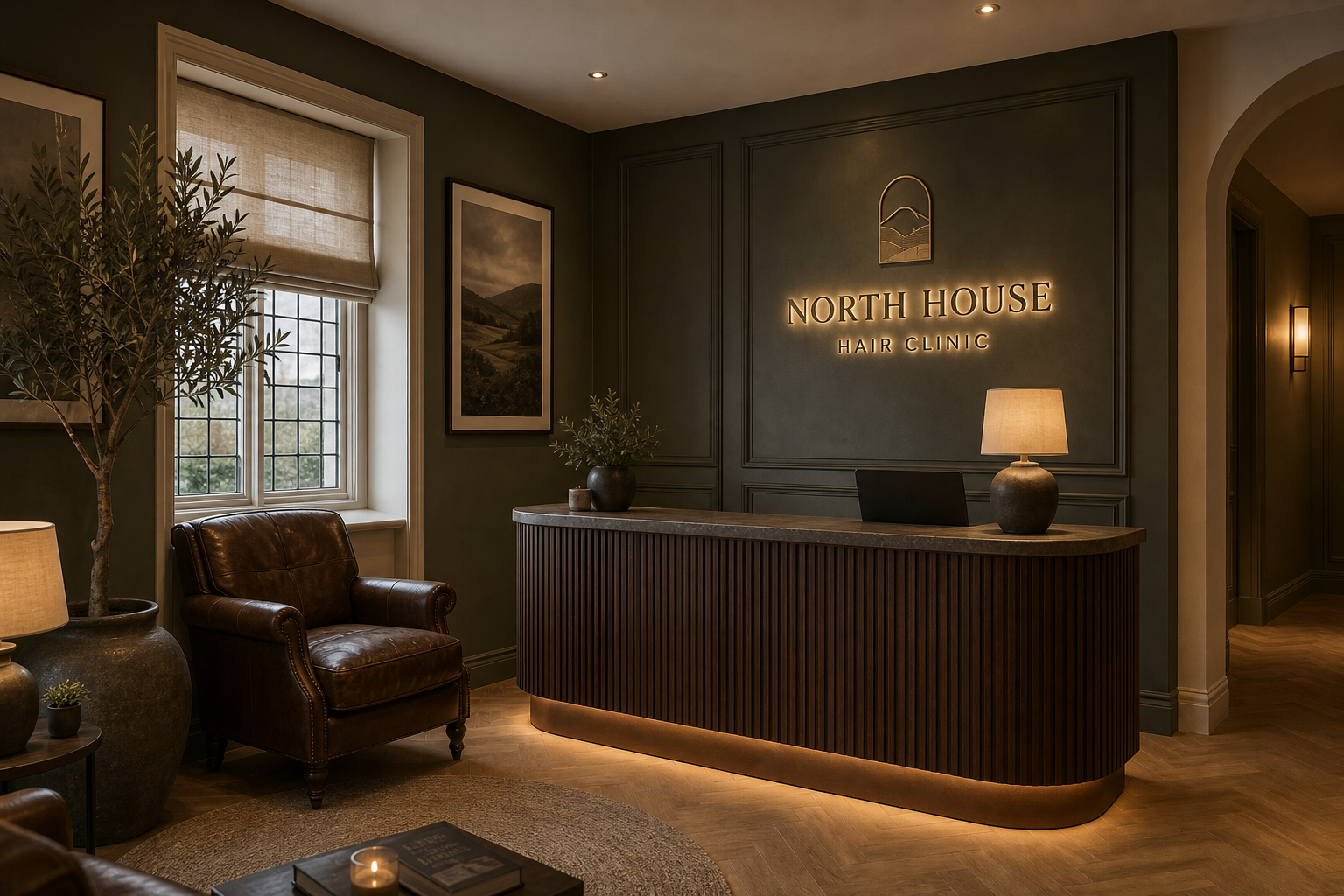
The same family, a shade more masculine. Dark walnut fluted desk, tan leather, slate and smoked glass, deep green and soft bronze, with a carved North House — Hair Clinic logo behind reception. Distinct enough to feel like its own destination.

  • Dark walnut
  • Leather
  • Deep green
  • Soft bronze
Branding wall concept render
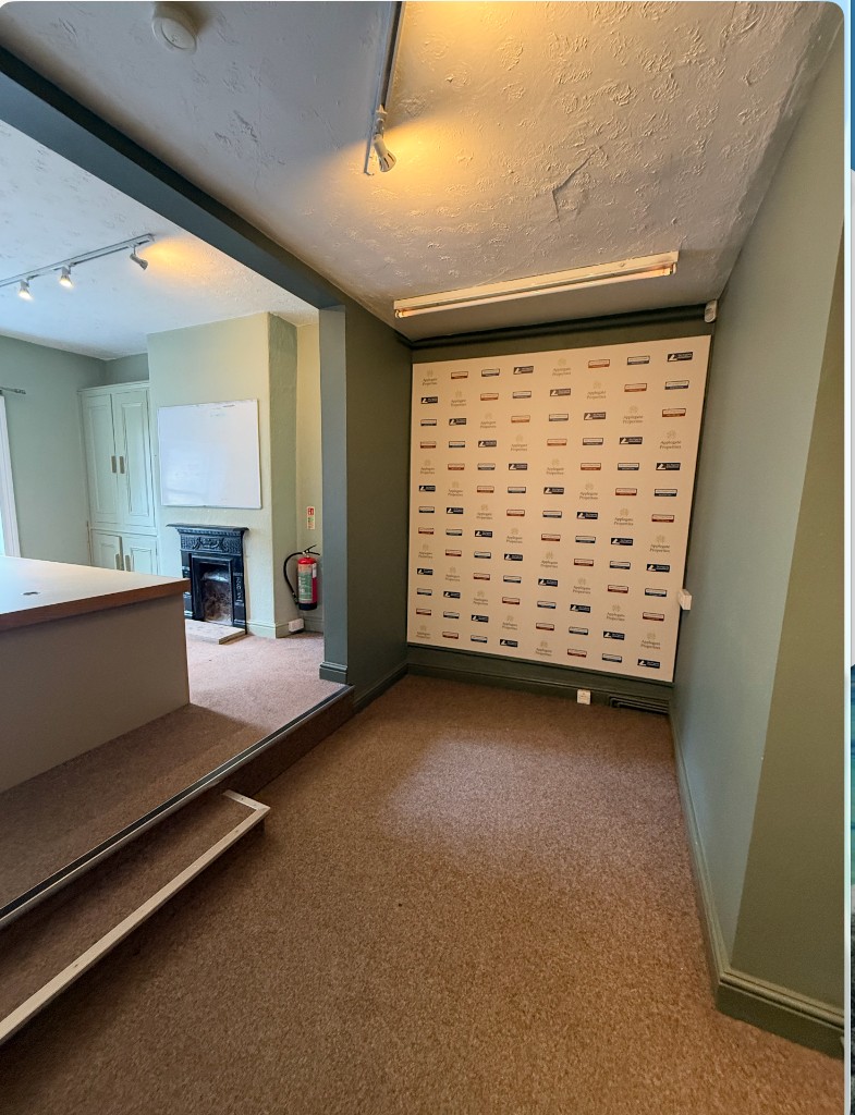
TodayBranding wall today
Brand · photograph-me moment

The branding moment

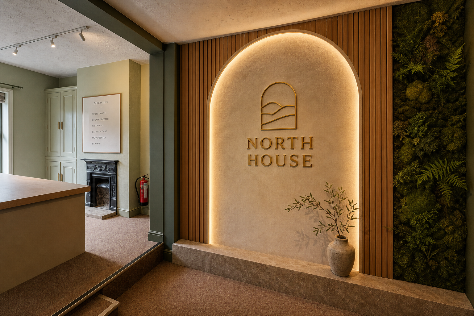
Not "a logo on the wall." An illuminated carved wordmark set into a limewashed arch, flanked by oak slats and a lush moss-and-fern wall, with a concealed halo of light behind. A wall that earns its place on every guest's phone — and their story.

  • Carved illuminated logo
  • Limewashed arch
  • Moss wall
  • Oak slats
Shopfront concept render
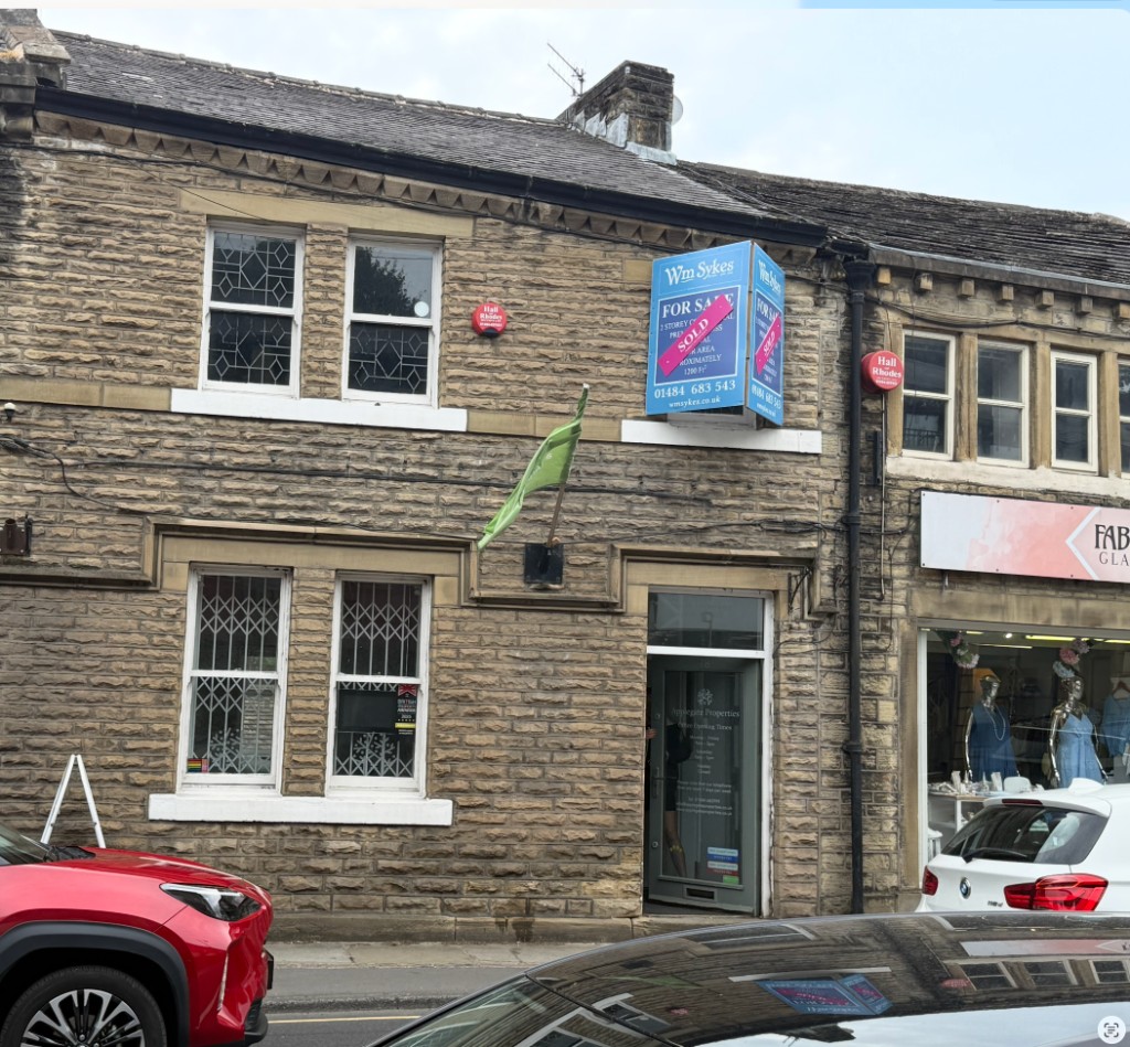
TodayShopfront today
Frontage · first impression

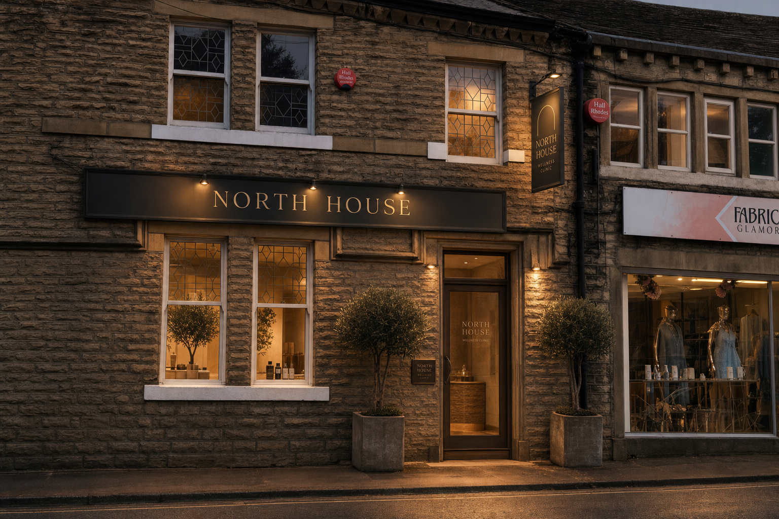
The frontage

Discreet, never clinical. Keep the honey Yorkshire stone; add a minimal painted fascia, a small bronze plaque, an elegant projecting sign and soft lighting, with a considered window display and clipped olive trees at the door. Understated, grown-up, quietly expensive.

  • Painted fascia
  • Bronze plaque
  • Projecting sign
  • Window display

One more thing — a signature scent.

Every serious luxury clinic now has one. A bespoke North House scent — think fig, cedar, warm stone and a note of Yorkshire green — diffused through reception and the treatment rooms. It's memory and brand in one, it can be sold as a candle or room spray at that retail niche, and people will smell "North House" long before they can name why they love it.

07 — Investment
Scope & pricing

Everything included — and exactly what it costs.

Itemised so you can see the value in each part and phase things if you'd rather. Brand & digital sits within the agreed ~£5–6k envelope; spatial visualisation is a separate, optional workstream.

DeliverableWhat's includedInvestment
Brand identity

Logo suite (Holmfirth-rooted mark, monogram, wordmark), the arch brand language, full colour palette, typography, plus interior & signage direction to guide the fit-out.

£1,250
Website design & build

Home, About / Meet the team, Treatments & pricing, Gallery, Where to park, and Contact. Responsive, on-brand, ready for enquiries and bookings.

£2,400
Gift voucher

Branded voucher design, print-ready and digital versions.

£180
Treatment plan booklet

Consultation → treatment documents designed into one cohesive, branded patient journey, built to update each visit. (You supply the clinical content.)

£680
Instagram kit

Six rotating branded post templates plus highlight covers, set up so you can update copy and imagery yourself weekly.

£540
12-month care retainer

Ongoing updates & maintenance for a year — small website edits, seasonal social refreshes and brand support.

Included
Brand & digital investment
Retainer value ~£600, included · within the ~£5–6k envelope
£5,050

Spatial visualisation

The room-by-room renders in The Building are a separate, optional workstream — AI-rendered concepts from your own photos to guide the fit-out and pre-sell the space. Quoted per room or as a set; a few sample rooms can be included to support the pitch.

Payment, your way

Cash, treatment-swap, or a mix — whatever suits us both. Domain is already yours; hosting & domain renewal billed at cost. If my time comes in under, I only charge for time spent.

Phasing

No need to do it all at once. Sensible order: 1) identity, 2) website, 3) collateral & social — with spatial visualisation slotting in alongside the fit-out.

08 — Next steps
How we get there

A calm, clear process.

  • React to this direction

    Tell me what lands and what doesn't — we lock the route, the palette and the logo direction. No pressure to take everything at once.

  • Identity finalised

    The Holmfirth-rooted mark, colour, type and the arch language delivered as editable files, ready for signage and the fit-out.

  • Website & collateral

    Site designed and built; gift voucher, treatment booklet and Instagram kit produced alongside.

  • Launch & care

    We go live to coincide with the opening, then the 12-month retainer keeps everything fresh.

A note from me

"This is the version I'm genuinely excited about. The building wants to be a wellness house — all we're really doing is letting it, and making sure the brand and the rooms tell one story."

Happy to walk through any of it, adjust scope, or start with the identity and take it from there whenever you're ready. — April